We all know how important it is to have a website be able to communicate with the world. A good website just ‘does the job’ – a great website exceeds all expectations and thus has a far better return! The million dollar question is however; what makes a great website?
No, really – What makes a great website?
That really is the million dollar question. Many people have tried to tie this down to mitigating factors – but at the end of the day, in my opinion – a great website is one which meets the following rules:
Content
Content is easy to find
It’s simple – if a user can’t find information they are looking for, they have no reason to be on your site. You need to make sure content is easy to find; and in a variety of ways. For example, on Missing Pixel you can search the site for any keyword which will return a list of matching articles/posts, or you can click on the Home menu to show every article posted sorted by date. Further to that, there is a tag cloud to search by keyword or a direct link to each month with the number of posts that were published during that month.
You might be wondering why I have left that as a way to search for posts? Well, in essence it was a really easy decision. Not only does it just add another form of search – but there are times when monthly archives make sense. For example, if a website regular was to go on holidays for 2 weeks in one month and then come back to your website next month, all they want to see is what they missed out on – and this is where monthly-archiving achieves a sense of purpose.
Besides, my reporting/stats definitely show people are using it! 172 uniques can’t be wrong, right?
All in all, make sure you take every step you can possible to make sure the user experience is a good one; allowing them to find content easily will definitely help that endeavour.
Original and fresh content that brings people back
We have lots of RSS subscribers. I’m a huge advocate of RSS feeds! It means people can stay in touch with your website/blog/online endeavour and not have to worry about constantly reloading for new content. On the flip-side, it’s that new content that keeps people coming back. Whether or not they actually physically click on your site to see it, or read it through their RSS; they are still a visitor and they still have to be tracked!
Google itself considers the freshness of a link a massive importance when determining PageRank and relevance. Make sure you set yourself a blogging/posting/editing schedule and follow it to the best of your ability! SEO-wise, make sure you keep your homepage fresh and beaming with new content – but importantly, do not neglect your inner pages as well.
When I say inner pages, I don’t mean to go back and worry about a blog post you did 10 months ago; we’re talking about your ‘About’ page, or your ‘Services’ page! Keeping those integral pages fresh makes sure: 1) they don’t fall into supplemental results, and 2) Google and other search engines show you some love for those pages too!
Aesthetics/Look and feel
The website is physically appealing to look at
Let’s face it – the only reason people still visit UseIt – Jakob’s usability portal is because of his tremendous advise. No one is going there to admire his website design!
Unless you are an online giant who already has a user-base that will never deplete, i.e. Google, (who when you think about it has great website design because it’s fit for purpose) – you really need to make sure you look into your website design. It doesn’t have to be glitzy and glow; just appealing to look at.
I mean you might have people looking at the screen whilst browsing your site or blog for more than 5 minutes on end (or you hope, anyway!). Do you want them to not come back because they found the site looked a little too 1998?
I’ve seen numerous websites my friends have set up with an amazing idea, or great content that have simply given way due to the in-assurances that come along with badly-designed websites.
Things are where the user expects them to be
This is an important one. If you can’t get your website to look ‘amazing’ – meet the user half way and at least promote a sense of structure and conformity. You need to make sure you set out your page elements to be where the user expects to see them. Unless you are going for an ‘outlandish’ theme or look which you are trying to get noticed for – make sure you take into consideration what I’m going to call the ‘6 section grid model for website layout’.
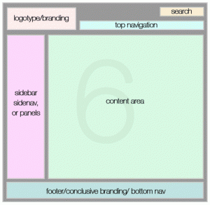
As you can see to the right, web users are now confortable with the following grid on many websites. Unless you are trying to break the Interweb apart [laughs] – make sure your logo is on the top-most left section of the website. Same goes for your site search (if any) and top-level navigation.
You might be thinking – but why doesn’t Missing Pixel have navigation directly to the right of the logo? Obviously that’s not the point I’m trying to make. My navigation is easily recognisable, as well as still sticking to the top right section of the page. Please keep in mind these grids are only meant to be a guide and are not meant to be followed to the ‘tee’.
As long as content is easy to find, sections are split into bite-sized chunks of similarly-grouped information, and your content area is the most-prominent section of your layout, you should be good to go!
Consistency in colours and scheme
Make sure you try to keep everything consistent! Colours, headings, everything! Sometimes plugins, and other things like Google ads might not help you because they only allow you to change certain bits of detail. Don’t let that stop you from making sure everything that is in your power is consistent. There’s nothing worse than 43.5 different types of link styles. You don’t want one link to have an underline, one not!
Consistency above all means that users find it easier to connect to your website and also get more a feel for how everything works and what stands for what – e.g. links.
User-centered
Usability and accessibility is practiced
This one is important for many reasons. Check that you have taken adequate steps to enhance the usability and accessibility of your website. If you have forgotten the difference between accessibility and usability, check out ’10 reasons to justify a website redesign’. I will be blogging in more detail about accessibility more than anything else in a future post – but for now, a little teaser:
Make sure you check how your website, and more importantly, links – look to someone who suffers from varying degrees of colour blindness.
You might think that checking things like that are ‘way too left-field’ – but something as simple as this can be checked in 10 seconds and can mean the difference between someone with colour-blindness not being able to distinguish between your linked content and non-linked content! You still thinking it’s not worth it?
If there was anything I could do to give everyone equal chance of viewing my content/website or what I had to offer – then of course I’m going to do everything in my power to achieve that!
Look carefully at the link colour on “Continue reading Facebook launches chat toolbar. Now they’re talking!”. Notice how it’s already changed from the real, default colour that non-colour blind people should make out?
The user always has an opportunity to right their wrongs
Make sure there is always a way out for the user. A top navigation, side navigation, search and links back home are great players in this field. No matter how good your website is, there will always be users who get lost along the way. Depending on the type of site you are running, you might want to try the Hansel and Gretel tactics of ‘breadcrumbs’. Whatever you choose, make sure the user has ways to right any wrongs they create along the way getting them off-track!
Meaningful file names
This isn’t only great for SEO; it works wonders for the user experience. The address https://missingpixel.net/what-makes-a-great-website/ is a lot better than https://missingpixel.net/?p=16. I mean it’s not rocket science! Make your URL’s as easy to follow as possible. I should know what the link is about before I even click it! Cloaking or hiding information in strange URL’s kill the user experience and kill user-confidence in your website. Don’t do it!
Site architecture
Logical site structure
Make sure your website structure makes sense. Top-down, there should be a logical flow. The header should come first, followed by navigation (if not already part of your header section), followed by the content with any sidebars or side-navigation, and ultimately followed by the footer of the page.
Footers are just as important as headers. a good footer helps the user determine if the page has fully loaded. If the user doesn’t see what they are used to seeing at the base of your page, they should know that the page has not fully loaded yet; bet you didn’t think about that one!
Folksonomy and taxonomy
Tag your content as much as you can. Tagged content means related content. Try to relate articles wherever you can. It doesn’t have to be a ‘Related articles’ or ‘related posts’ section. It could be as easy as linking the user to relevant articles/web pages based on the current content of the page. Don’t just link-out for the fun of it – or to get more hits!
The way you classify and connect your information is just as important as the information itself! Keep that in mind when you are writing your next article or designing your upcoming website.
Purpose
At the end of the day, if there is no purpose to your website, then it won’t survive for long. Find a niche if you can and tackle it. if you are dealing with something that is ‘way beyond your marker’ or something which is totally hard to place yourself in; whether it be ‘Web design’ or ‘Get rich quick schemes’; the process is the same: find a reason to bring visitors back for me! Whether it is super-cool, fresh, relevant content, or a cool flash game that people just can’t get enough of!
Everything you create online should have an ultimate purpose to succeed!
Tracking and reporting
Finally, great websites learn from their mistakes! Use tools such as Google Analytics to help you determine popular and not-so-popular sections of your website. See if you can get down to the reason why ‘x’ is not as popular as ‘y’.
Good webmasters compare pages that work and don’t work and will simply weed-out or unpublish something which just isn’t pulling in the visitors as it did before. Greatwebmasters/designers will isolate the page and find out WHY it is failing.
Did you recently put some plugins such as text-ads or any other plugins which may have affected that page? Is there even a way to reach that particular page from other prominent sections of your website?
Put it this way: articles which you may have written 12 months ago, may become tomorrow’s most popular article online! History can and does repeat itself. What was last year’s news may, for whatever reason become popular again. Do not unpublish articles or remove pages simply because ‘they are getting too old’ or ‘you are running out of space’. Get more space!
There you go guys – another one bites the dust. Hopefully these articles/tutorials are hoping you achieve the best you can out of your website and online experience. Please share this post if you liked it.